Brand
Guidelines
This guide is designed to help you bring the brand to life with clarity and confidence. Whether you're creating a deck, building a product, or designing a campaign, you'll find everything you need to stay aligned. This isn't just a place to download files, it's a tool for expressing Arcium with consistency, purpose, and style.
1.0
Brand Marks
Our logos carry the weight of our identity, so it’s important they’re used with care and consistency. This section shows you how to apply them the right way, every time.
2.0
Typography
Consistent use of our typefaces helps create a cohesive voice across every touchpoint. This section outlines the fonts we use, how to apply them, and best practices for hierarchy, spacing, and readability.
3.0
Colors
When our colors are used together with intention, they give our brand flexibility without compromising consistency. This section shows how color can be layered, balanced, and brought to life across different types of content.
1.1
Primary Signature
Download Icon
Arcium Logo Signature Safe Space
We’re still establishing awareness in the market, which this lockup is the most effective tool we have for building brand recognition. The symbol and wordmark work in tandem to reinforce our identity. When people see our symbol, we want them to associate it directly with our name.
1.2
Secondary Logomark
Download Icon
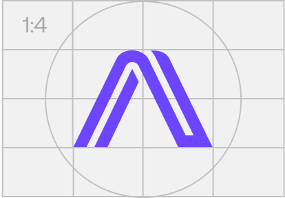
Arcium Logomark Color
The logomark is our most minimal brand expression. It’s ideal for use in small or constrained spaces. Think profile images, app icons, web clips, and favicons. It also works well as a graphic signature or stamp, adding a subtle but distinct brand presence on items like business cards, lanyards, or apparel. Over time, this standalone mark will act like a fingerprint for the brand: compact, iconic, and instantly recognizable.
1.3
Tertiary Wordmark
Download Icon
Arcium Wordmark Safe Space
Our wordmark can be used independently in instances where a cleaner or more typographic treatment is needed. For example, it’s used in the footer of our website, in navigation menus, or in editorial layouts where the full name adds clarity. While it lacks the symbol of the logomark, it still contributes to our brand’s presence through consistent type and spacing.
Arcium Logo Signature (Color)
Color Combination 1
Color Combination 2
Arcium Logo Signature (White)
2.1
Primary Typeface
Download Icon
Aeonik Pro is our primary typeface. A contemporary neo-grotesque, it strikes the right balance between clarity, legibility, and modernity. It performs beautifully at both small and large scales, clean and efficient for dense UI environments, while delivering presence and personality in display applications. Its versatility makes it an ideal foundation for a future-forward brand.
2.2
Secondary Font
Download Icon
Dot Matrix Two
Abcdefghijklmnopqrstuvwxyz123456789!@#$%^&*()_+{}[]:";'<>,./
Dot Matrix Two is used sparingly to add character and distinction in moments where the brand needs to show more personality. Inspired by digital and tactile systems like braille, it ties into our broader visual language in a way that feels playful but considered. It’s especially effective in tech-forward, expressive layouts where texture and tone matter.
2.3
Tertiary Font
Download Icon
Cropaso
Abcdefghijklmnopqrstuvwxyz123456789!
Cropaso is our tertiary typeface. It’s used selectively for moments that call for a more stylized expression. Think sub-brands, cover pages, or special edition content. While not used widely, Cropaso plays a key role in our wordmark and helps define visual hierarchy in distinctive, high-impact executions.
2.3
Type in Use
3.1
Color Palette & Proportions
Download Icon

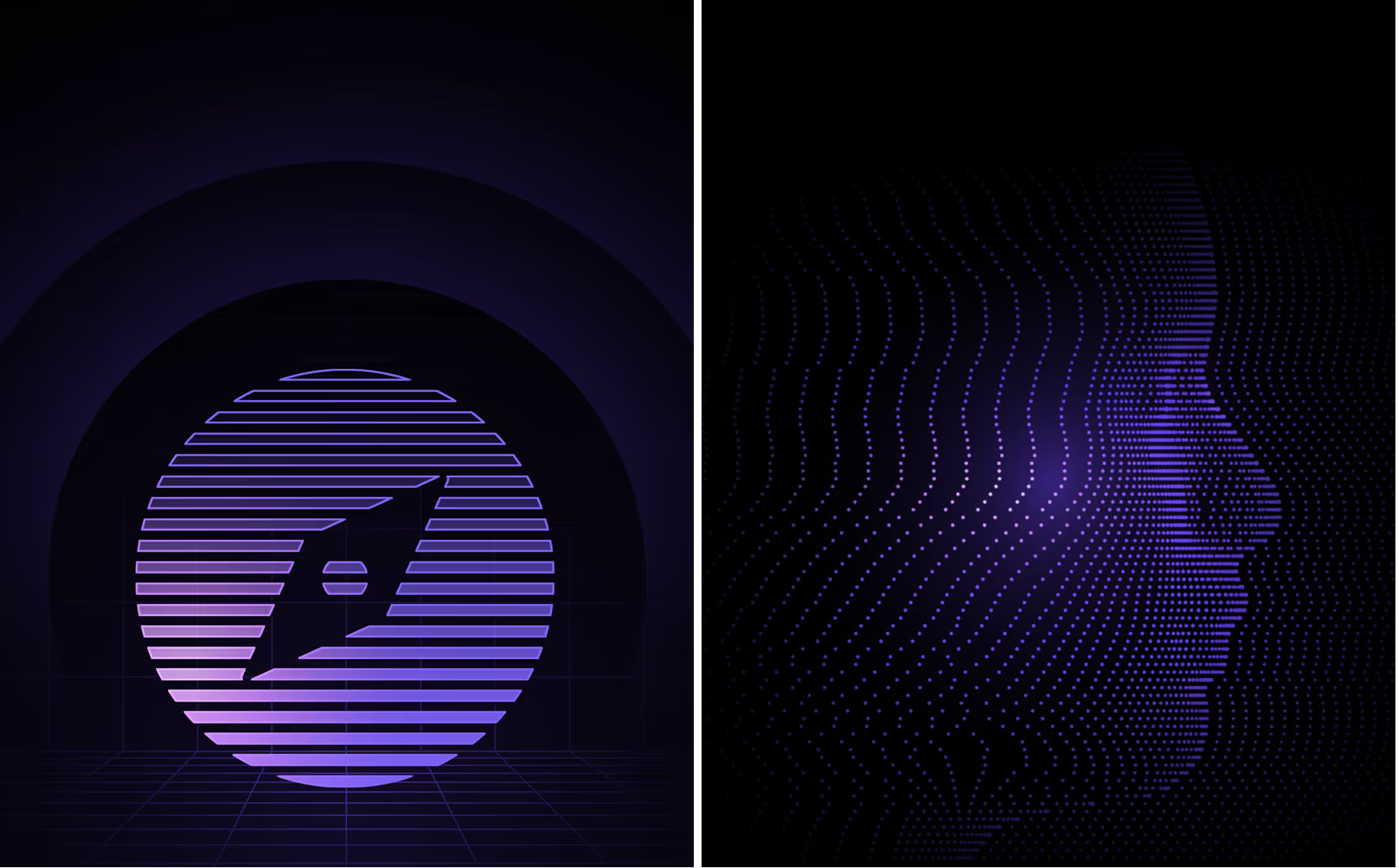
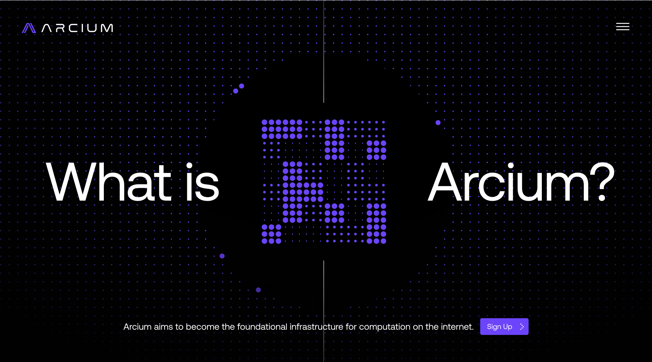
Our primary neutrals: black, and soft gray, ground the brand in clarity and pragmatism. They create a clean, rational foundation that keeps the identity accessible and versatile across different contexts.

Our primary highlight, a vibrant purple, brings energy and a contemporary edge. It signals our commitment to innovation without leaning into overused crypto or blockchain tropes.

Our secondary highlight (pink) is used with restraint. It’s a supporting accent, offering subtle dimensionality only when our primary highlight has reached its expressive limit.
Primary Neutral (Light)
Mist Grey #F1F1F1
Primary Neutral (Dark)
Black #000000
Primary Highlight
Purple #6D45FF
Secondary Neutral (Contrast)
Mist Grey #F1F1F1
Secondary Neutral (Medium)
Black #B7B7B7
Secondary Highlight
Pink #F1A1FF
3.2
Color In Use